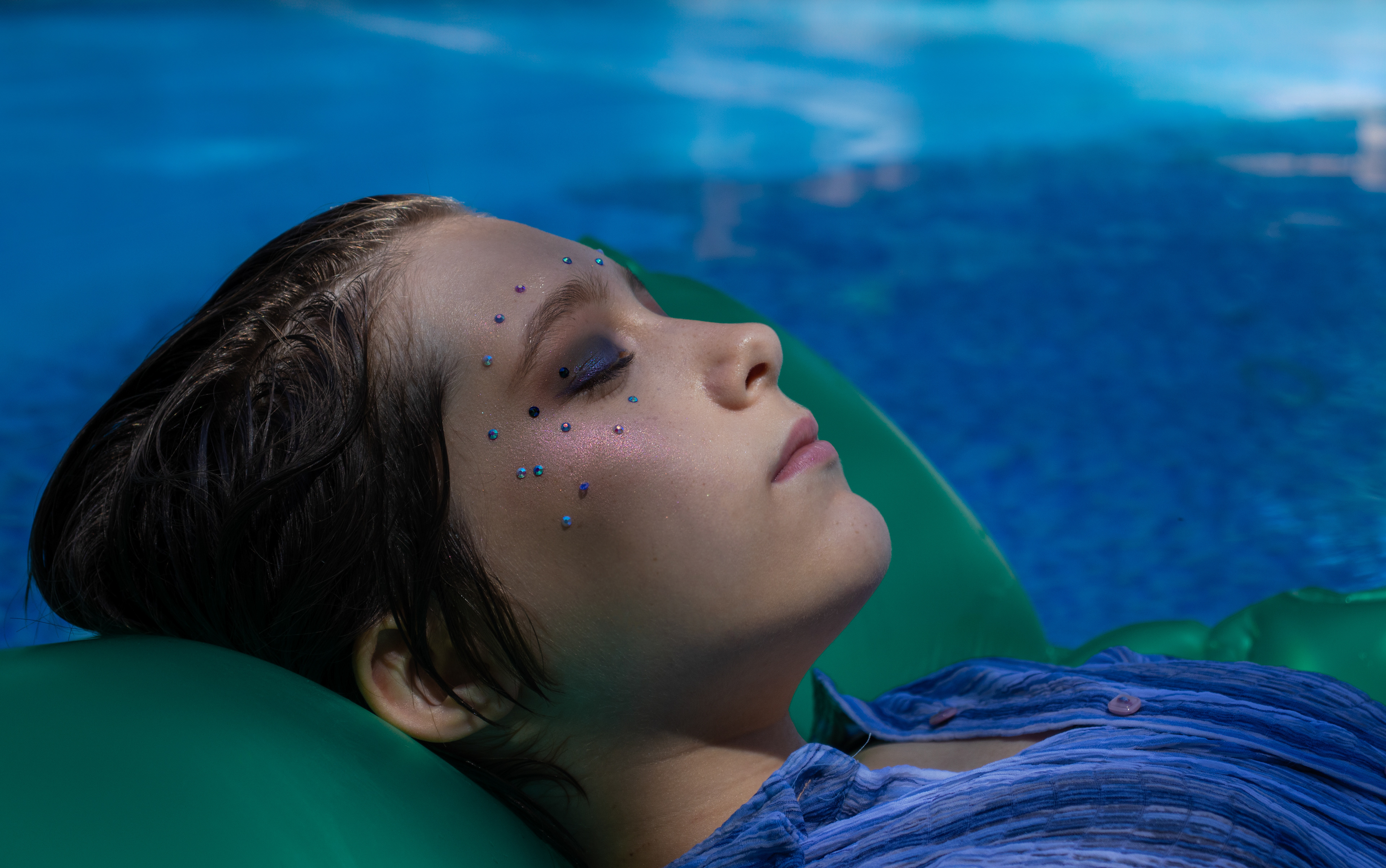
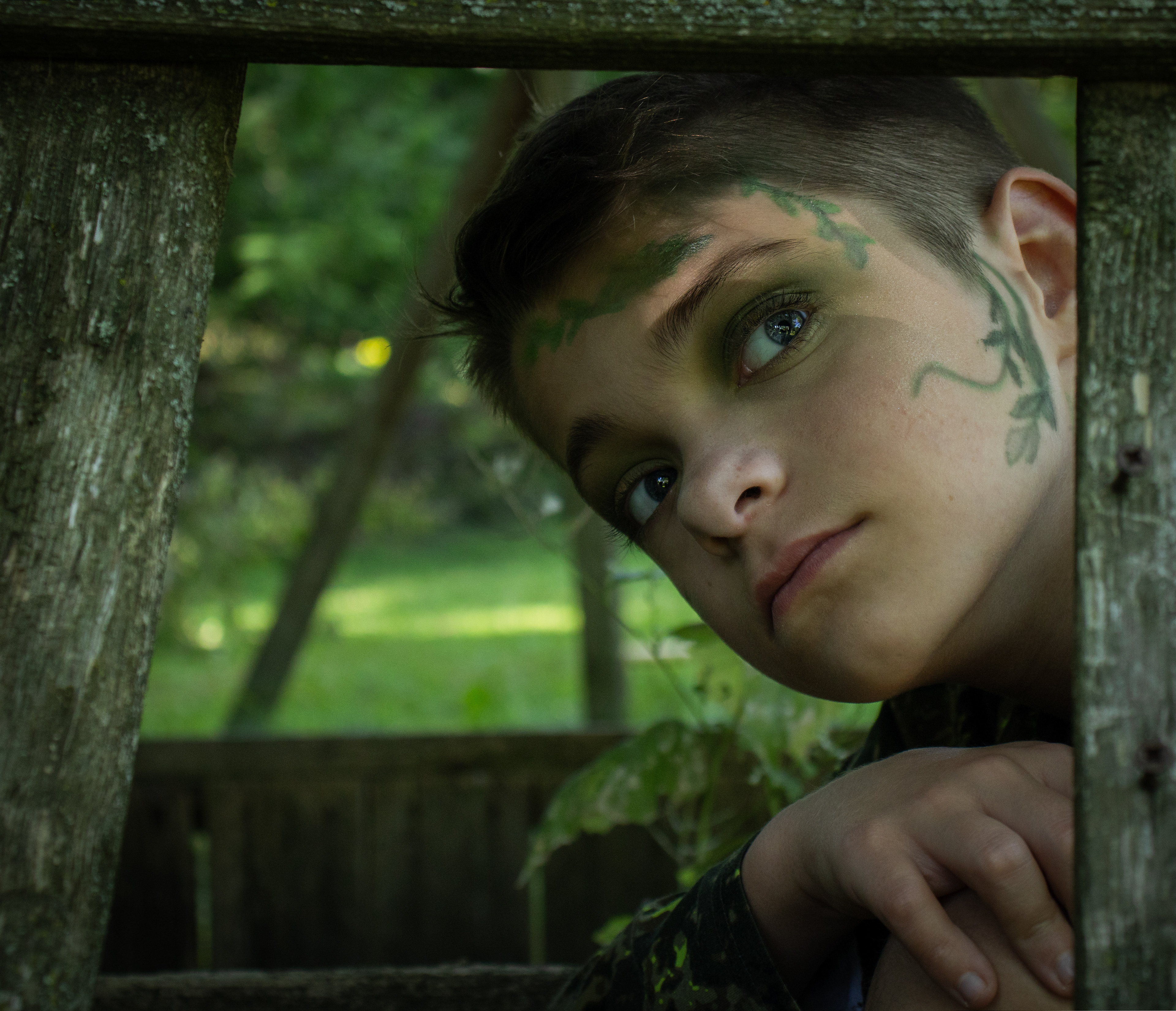
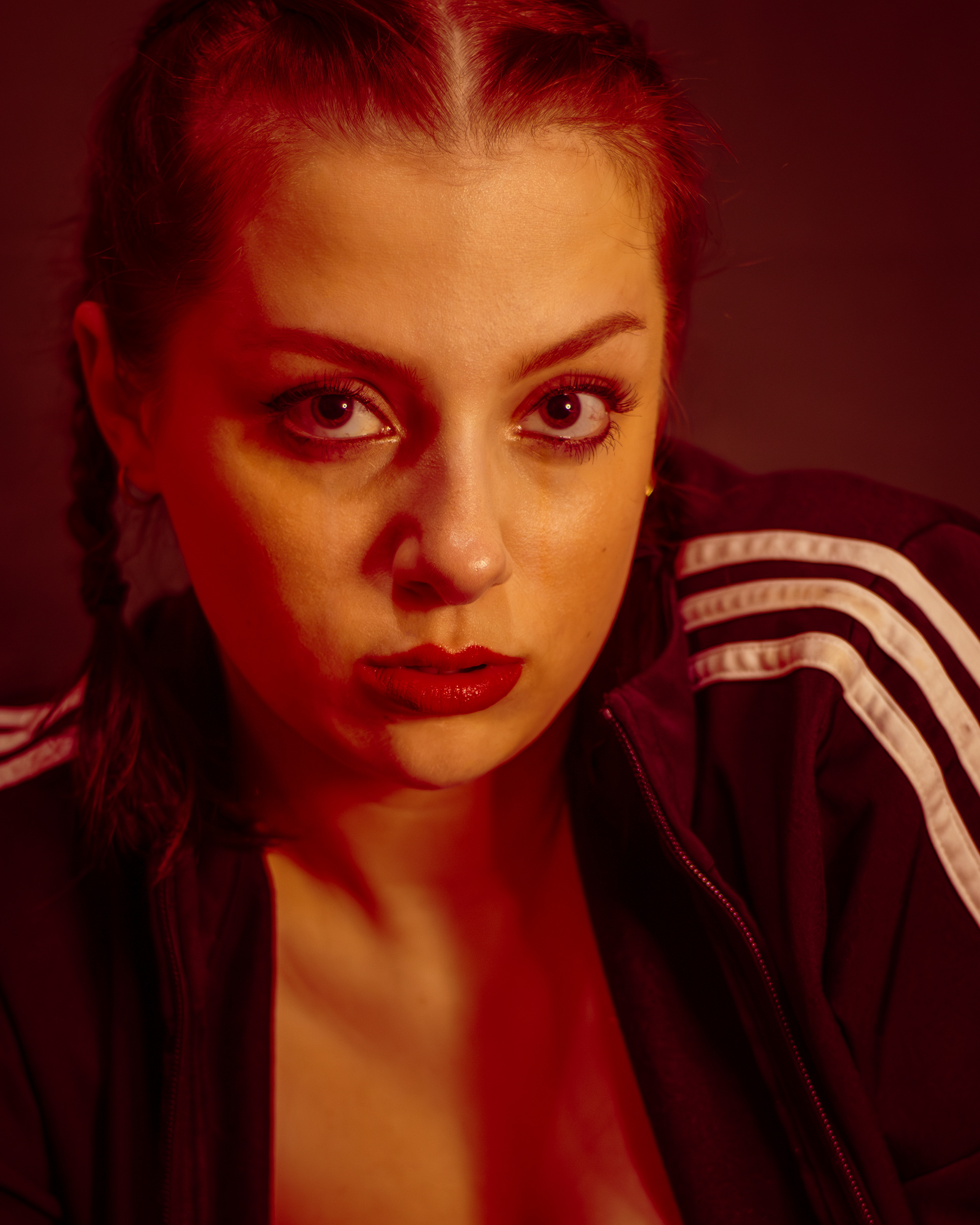
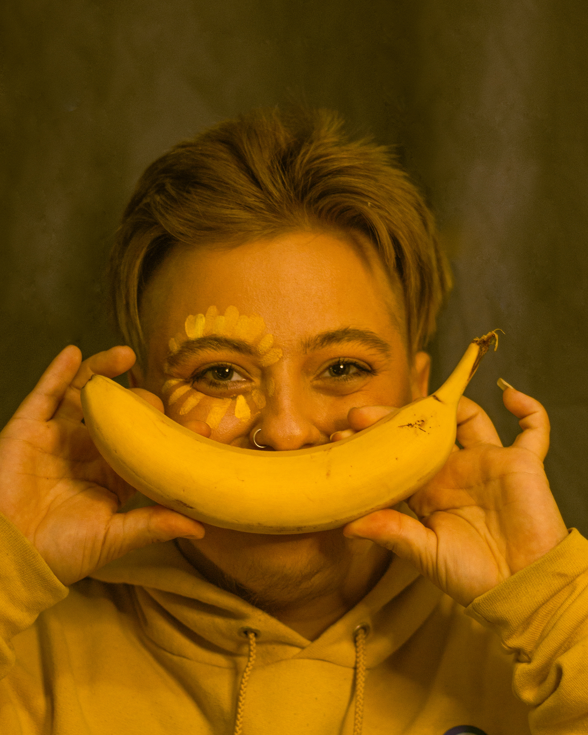
The (Hue)man Condition is my final project from my digital photography class this past semester. This project is a visual exploration of color psychology and portraiture. Focusing on red, blue, yellow, and green, the series reveals how color shapes mood, perception, and emotion. Each portrait was styled and directed to embody its corresponding color: blue as calm/serene, green as organic/earthy, red as fierce/bold, and yellow as joy/nostalgia.
Featuring my three siblings and myself, the series is both conceptual and personal. Through styling, makeup, and art direction, I aimed to translate design principles like color theory into human expression. Ultimately, The (Hue)man Condition demonstrates how different hues can make us feel, merging graphic design fundamentals with photography’s emotional language—highlighting the psychological power of visual elements.